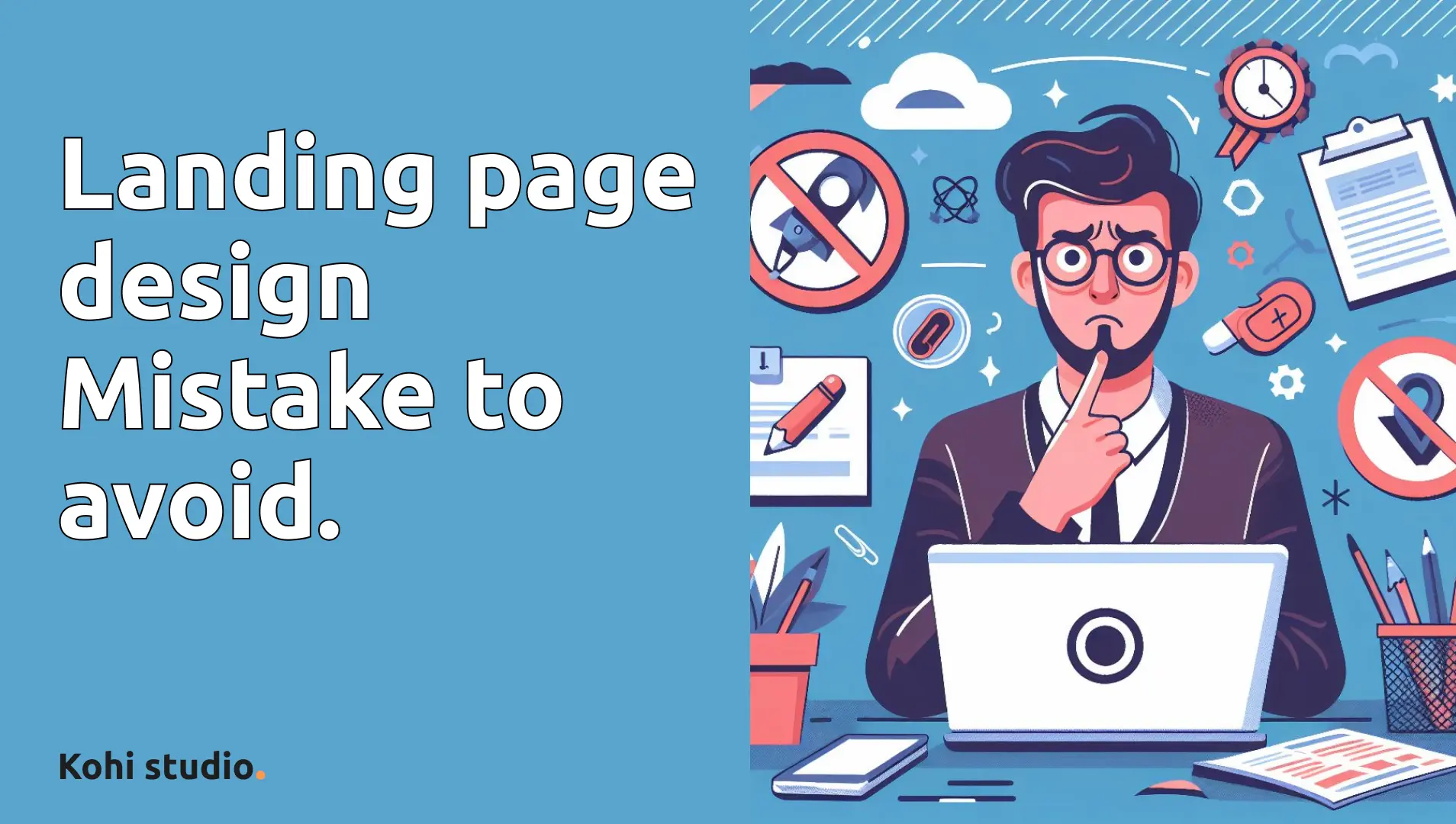
50 Common Web Design Mistakes to Avoid for an Optimal User Experience
- Kohi studio
- Website , Tips
- 20 Apr, 2024
Welcome to our comprehensive guide on common web design mistakes! As a website designer, your primary goal is to ensure a seamless and enjoyable experience for users navigating your site. However, it’s easy to fall into common pitfalls that can hinder usability and drive users away. In this blog post, we’ll explore 50 common web design mistakes and provide actionable tips on how to avoid them for an optimal user experience.
Navigation and Menus:
-
Hidden Navigation
If the navigation can fit on one screen, put it on the screen. Don’t make users click to see the navigation. This can be frustrating for users and make it harder for them to find what they’re looking for.
-
Dropdown Navigation
Dropdown menus that require users to click for navigation can create unnecessary friction and slow down the browsing experience. Opt for hover-activated dropdown menus to streamline navigation and improve user engagement.
-
Forced Click for Dropdowns
Forcing users to click a drop-down in the navigation for it to appear: It should appear on hover. This can be frustrating for users and make it harder for them to find what they’re looking for.
-
Top-aligned Navigation
Navigation should always be at the top: A left menu can sometimes be okay but if you want to make it as easy as possible to use your website, it should be at the top. Instead, keep the navigation at the top for better user experience.
-
Home Link in Navigation
Not having the home link in the navigation: Not every user knows that the logo is a reliable way to get to the home page. Instead, include a home link in the navigation for better user experience.
-
Footer Links
Not putting links in the footer: People use them and expect them so put them there. Instead, include important links in the footer for better user experience.
Design Layout and Alignment:
-
Center Aligning Everything
Center aligning everything, especially text, can be difficult to read and look unprofessional. Instead, left-align text for better readability.
-
Justified Text Alignment
The inconsistency between the spacings of each word makes it harder to read. Instead, use left or right alignment for better readability.
-
Horizontal Submenus
Horizontal submenus: Users expect it to be vertical. Instead, use vertical submenus for better user experience.
-
Horizontal Scrolling Websites
Stop trying to be special at the cost of user experience. Instead, use vertical scrolling for better readability.
-
Shorter Hero Sections
Hero sections that span the entire height of the screen: This creates a false impression that the website doesn’t have more content and that you’re at the end of the page. Instead, use a shorter hero section for better user experience.
-
Horizontal Text Alignment
Vertically align text: This is another example of sacrificing UX for UI. Instead, align text horizontally for better readability.
-
Hero Sections that Span Entire Height
Hero sections that span the entire height of the screen: This creates a false impression that the website doesn’t have more content and that you’re at the end of the page. Instead, use a shorter hero section for better user experience.
-
Consistent Scrolling
If your design is so unintuitive that it requires you to tell me to scroll, then your design has failed: Go back to the drawing board. Instead, make the design more intuitive.
-
Opaque Backgrounds for Text Legibility
Text over background that isn’t opaque enough to be able to clearly read the text in front of it: This makes it hard to read the text. Instead, make the background more opaque for better readability.
Visual Elements:
-
Sliders
Sliders aren’t effective and very few people will actually use them. Instead, consider using a static image or a video that autoplays.
-
Auto-playing Sliders Auto-playing sliders: This can be frustrating for users who have to wait for the slider to finish before they can see the content. Instead, allow users to control the slider with buttons or arrows.
-
Styled Scroll Bars Styled scroll bars: Don’t mess around with the scroll bar, it’s meant to be a consistent feature. Instead, keep it simple and easy to use.
-
Marquees or Horizontal Scrolling They’re annoying to look at and difficult to read. Instead, use vertical scrolling for better readability.
-
Changing Background Color on Scroll Changing background color as you scroll: It takes away from the content and it’s just distracting. Instead, keep the background color consistent for better focus on the content.
-
Emojis It just looks unprofessional. Instead, use professional and clear language.
-
Vague H1 Tags This is bad for user understanding and SEO. Instead, use clear and descriptive h1s for better user experience and SEO.
-
Typewriter Text Effects It’s annoying as hell and it hurts user experience. Instead, use static text for better readability.
-
Inclusive Logos Logos that don’t have the name of the company in it: How are users supposed to know who you are based on an icon? Instead, include the name of the company in the logo.
-
Ignoring Web Design Standards Don’t try to be special at the cost of user experience. Instead, follow web design standards for better user experience.
-
Overusing Visual Effects It takes away from the content and it adds more load and complexity to your website. Instead, use visual effects sparingly for better user experience.
-
No Auto-playing Videos Auto-playing videos: Don’t make users work to see content. Instead, allow users to control the sound.
Form Design:
-
Labelled Forms This is bad user experience. Instead, use labels for better user experience.
-
Combining First and Last Name Fields In small to medium-size forms, having less fields has shown to increase conversions. Instead, combine the two fields into one full name field.
-
Left-aligned Text Forms They should always be left aligned for better usability. Instead, left-align text forms for better usability.
-
Forms without Labels This is bad user experience. Instead, use labels for better user experience.
Call-to-Action (CTA):
-
Contrasting Call-to-action Colors You’re just losing out on conversions. Instead, use a contrasting color for better visibility and conversion.
-
Wider Buttons People expect buttons to be wide. Instead, use wider buttons for better user experience.
User Experience:
-
Splash Pages Splash pages hurt SEO, decrease conversions, and waste users’ time. Instead, direct users straight to the homepage or a landing page.
-
Slow-loading Animations These can make it impossible to quickly scan a website for content. Instead, use faster loading animations or static images.
-
Hidden Scroll Bars The scroll bar is meant to be a consistent feature to navigate websites. Instead, keep the scroll bar visible for better user experience.
-
Controlled Scrolling Scrolling should be consistent from website to website. Instead, allow users to control their own scrolling.
-
Time-consuming Opening Messages Users don’t want to wait for a message to disappear before they can use the website. Instead, keep messages short and to the point.
-
Long Menu Animations They’re unnecessary and can be frustrating for users. Instead, keep menu animations short and simple.
-
Sticky Menus without Background How is this a good thing? Instead, use a background color for better visibility and user experience.
-
Clear Navigation with Arrows This makes for better user experience and understanding. Instead, use arrows for better user experience.
-
Informative Home Pages The home page is the most important page of your website, so it should be informative enough to give the user at least a general idea about who you are and what you do. Instead, make the home page more informative.
-
Efficient Content Loading Instead of trying to hide how slow your website is, stop adding in all this eye candy so you don’t need preloaders in the first place. Instead, optimize your website for faster loading.
-
Optimized Loading Optimizing your website for faster loading reduces user frustration and improves engagement. Instead, implement best practices for image optimization, code minification, and server caching.
-
Avoid Slideshow Homepages There just isn’t enough room to have the amount of information an effective home page requires with this layout. Instead, use a layout that allows for more information.
-
Minimize Pop-ups They’re intrusive and can be frustrating for users. Instead, use less intrusive methods to capture users’ attention.
-
Smooth Scrolling Make sure the scrolling is smooth and consistent throughout the website. Instead, use smooth scrolling for better user experience.